Timeline: Oct’18 – May’19
At Canada Life (then Great West Life), I led the redesign of the Group Retirement Savings (GRS) Portal to address performance and usability issues in the legacy web app. As Lead Interaction Designer, I collaborated with a multidisciplinary team, conducting user research and creating personas to guide design decisions. I focused on simplifying complex financial data, improving interactions with investment details, and enhancing the statement generation process. The project introduced features like real-time status updates and intuitive icons, leading to an 81% satisfaction rating. It also won the WMA Award for Outstanding Website in 2020, significantly improving user engagement and customer satisfaction.
Intro
Great West Life (now re-branded as Canada Life) offers wealth and retirement savings plans to the employees of large and medium sized businesses. These plans are serviced through a web application called GRS Access. The legacy web app had become obsolete and needed a digital transformation to address numerous performance issues, usability issues and customer grievances. Customer retention, ratings improvement and cost reduction were set as two of the major expected outcomes from this project.
My role
Lead Interaction Designer
I worked closely with a Product Owner, Solutions Architect, QA and UI Developers..
Process
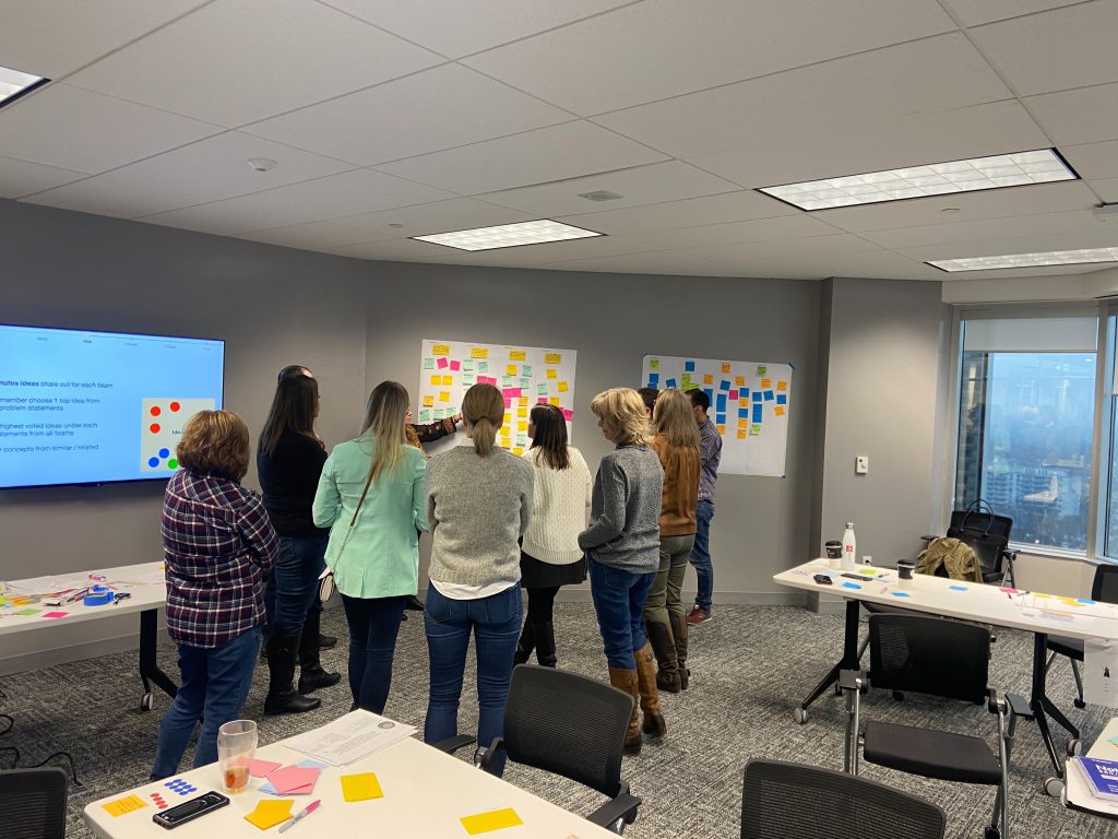
This project was undertaken in a digital labs format at Great West Life. An agile team was formed with Product Owner, Business Analysts, UX Designers and Developers with support roles added for various touch points such as content, compliance and marketing.
UX team played a key role in driving decisions and making sure that the outcomes were truly user centric, led by the process below:
- User research
- Data analysis and clustering
- Persona creation
- Problem statements formation
- Ideation workshop
- Wireframing and prototyping
- User testing and refinement
- Visual mockups and specs creation
Problem solving
Financial services domain offers great opportunities to solve some of the very complex problems in the human computer interaction space.
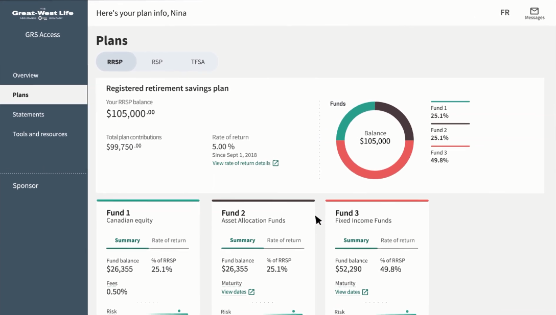
Plan details
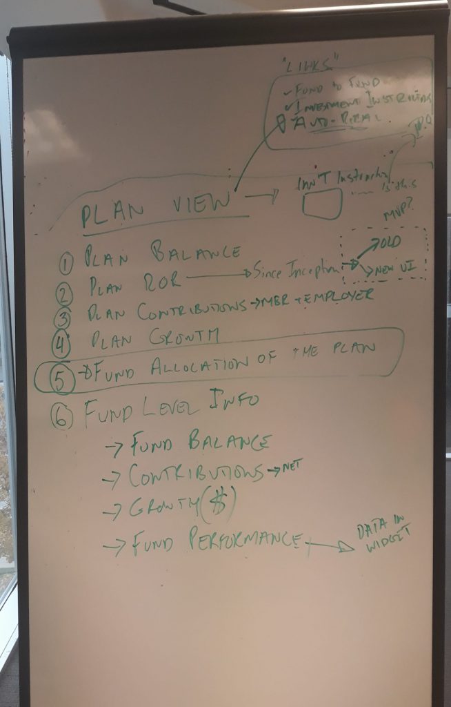
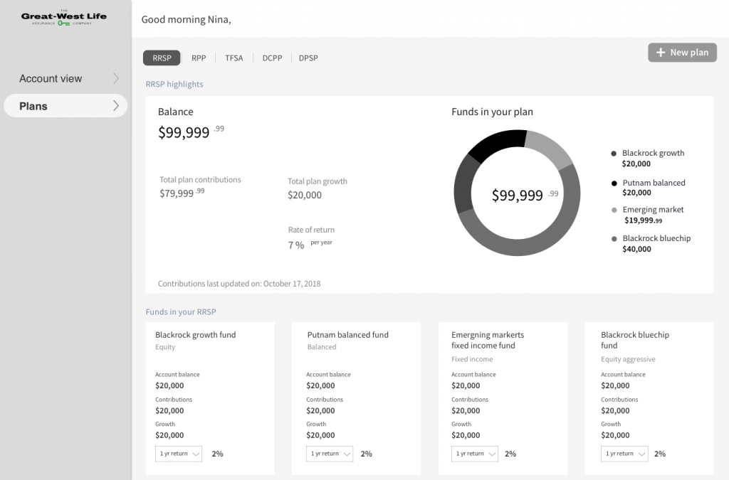
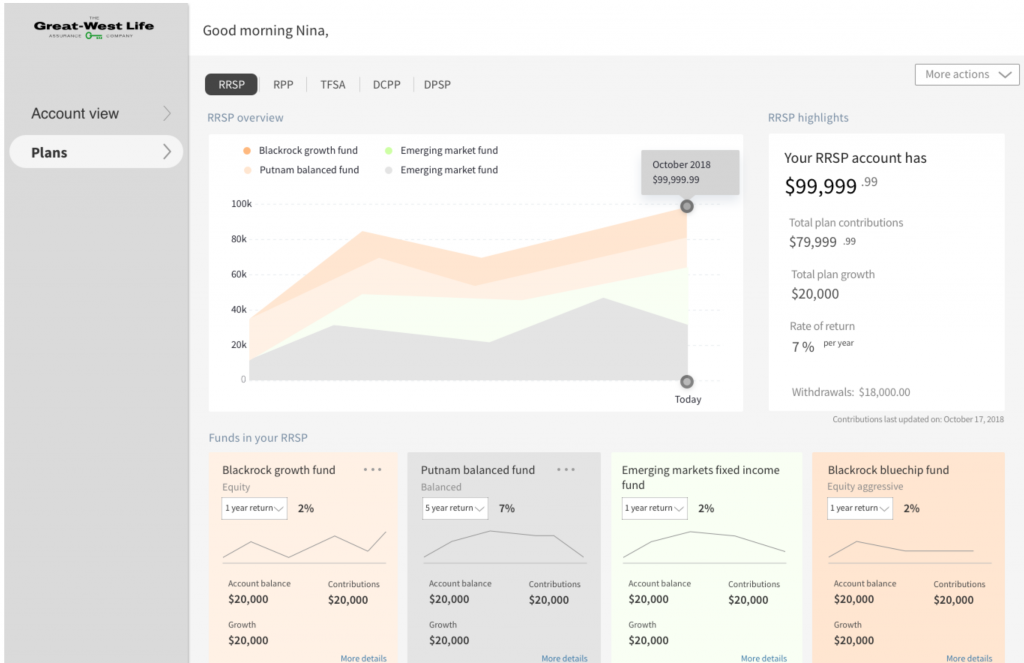
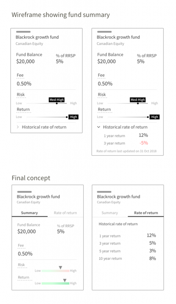
User interviews and formative research informed us about the key data points that were important for decision making. I needed to provide overview of different savings plans that member owned and information about all the investment funds with in that plan. The challenge was not to overwhelming user with financial jargon and also promote learning.

Digital statements
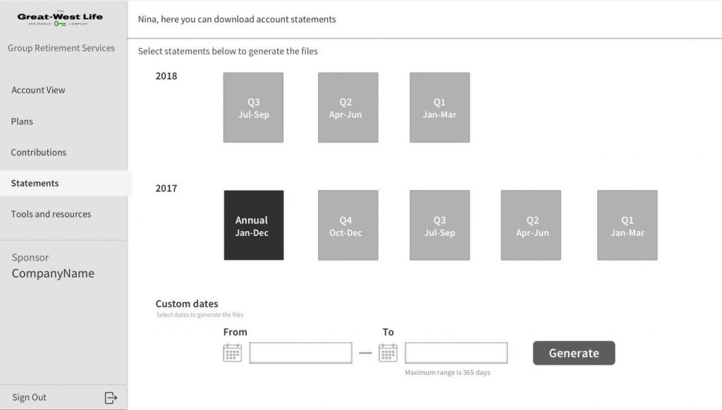
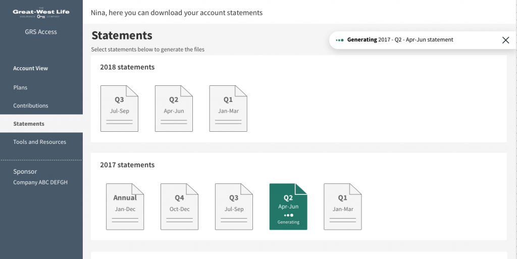
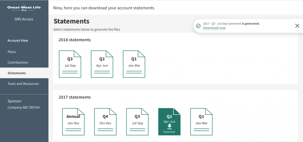
Online statements was one of the most in demand feature of the legacy portal but came with its own shortcomings. Statement generation took sometime that could go up to a few minutes in some cases. There was no indication of the real time status of the process which annoyed users. Also, users would have to provide calendar dates to generate even the most commonly used statements such as yearly and quarterly ones. I solved these issues by objectifying the most commonly generated statements as selectable icons. Furthermore, status was provided irrespective of which section user was viewing to provide real time information.
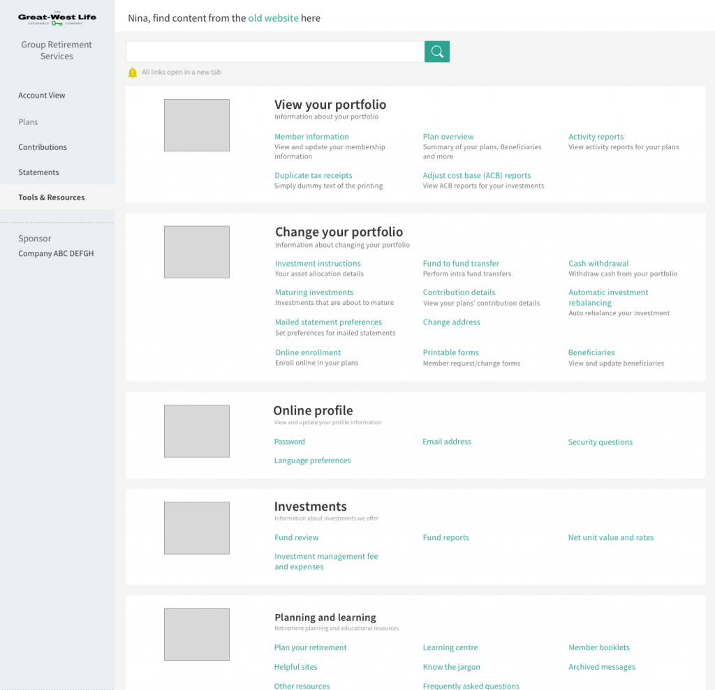
Tools and Resources
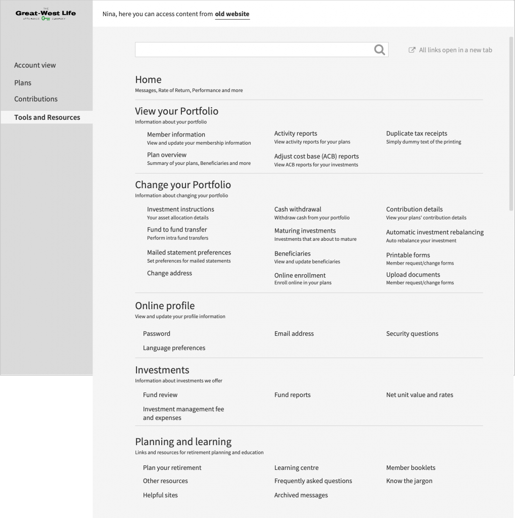
As we progressed through the MVP of GRS Access, many of the existing legacy site features needed to be housed at a location within the new experience. It was critical to get the information architecture and the context right.
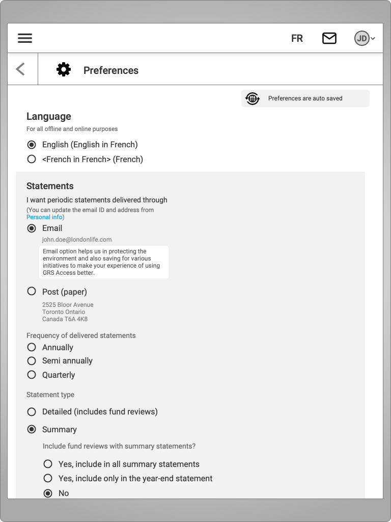
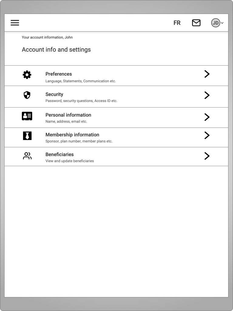
Responsive and adaptive views for different screen sizes
Mobile and tablet versions of the new experience was designed and proposed wherever felt necessary. Based on analytics, we found out that GRS Access was getting more traction on mobile devices although the percentage of users using desktop remained very high at more than 80 percent.
