Timeline: Apr’20 – Mar’21
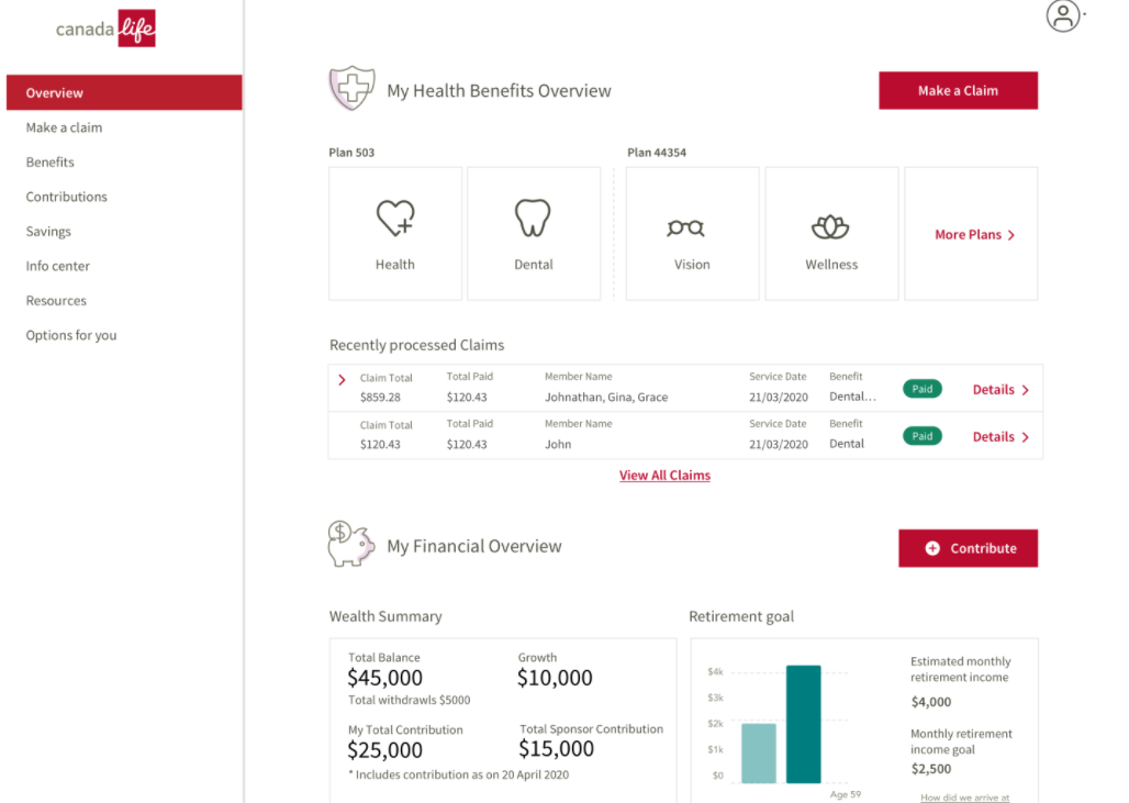
At Canada Life, I led the redesign of a unified digital experience for accessing health benefits and wealth plans following the company’s rebranding. As Team Lead Product Designer, I worked closely with a UX researcher to conduct extensive user research with 17 participants, identifying key pain points and needs. This research informed the creation of user personas and the design of a cohesive dashboard that integrated health and wealth benefits. I developed wireframes and prototypes, ensuring a clean separation between the two sections while maintaining a unified view. The resulting MVP design led to an 86% user satisfaction rating and helped acquire new customers, significantly improving user engagement and overall satisfaction with the platform.
Intro
After the company’s successful rebranding as Canada Life, leadership went ahead with the plan to create a new unified experience for accessing health benefits and wealth plans. A new digital lab was created to achieve this goal. This was a massive task, as existing apps for health and wealth benefits were humongous, with their own systems and infrastructure. This undertaking was disruptive to the existing business models, and we needed to be sure that users would welcome this initiative.
My role
Team Lead Product Designer
User research
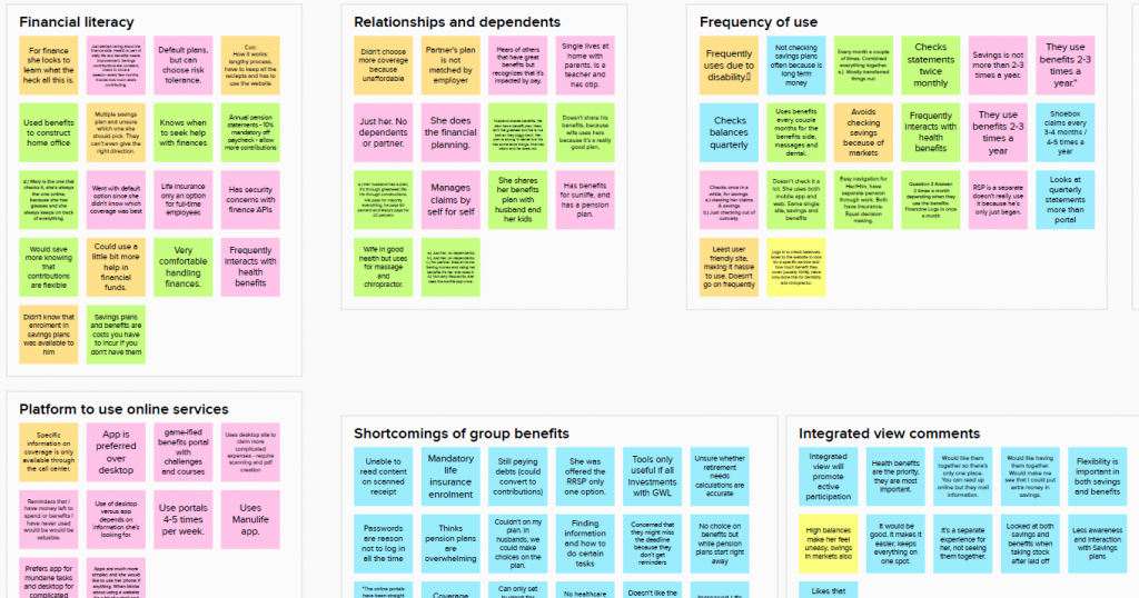
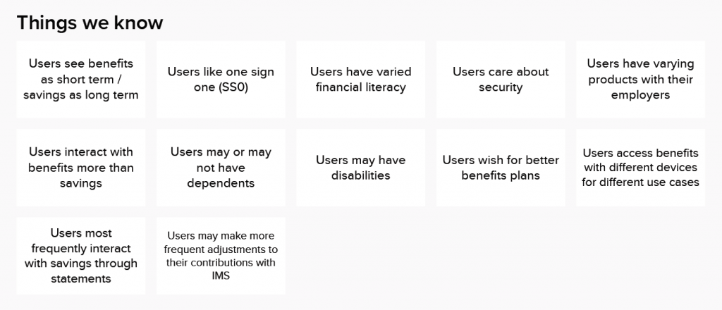
We interviewed 17 users to understand their motivations, behaviors, and pain points when it came to using their employee benefits. This was a new way of visualizing and thinking about their benefits. I wanted to understand what scenarios would be in which users would value such an experience. To uncover the unknowns, I created a research plan and executed it with the help of the in-house UX team.
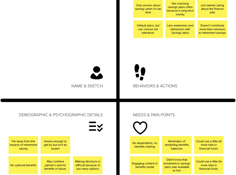
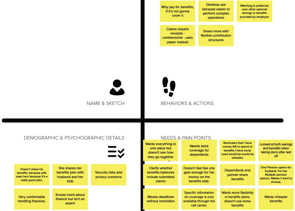
We collaborated over a week to carry out interviews, collect data, and perform analysis. The result was the creation of three user personas with a clear set of priorities. The primary persona was more engaged and hands-on with the health benefits and savings plans. The secondary persona came from a younger age group and was less worried about savings but more interested in regular health benefits. The third persona was special, with a disability; this user expected automation and relied heavily on the online experience to perform everyday tasks.
Problem solving
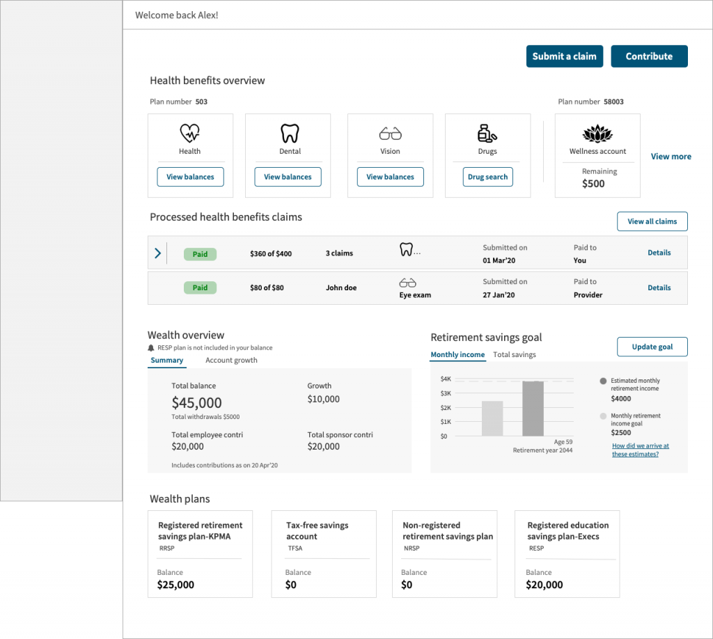
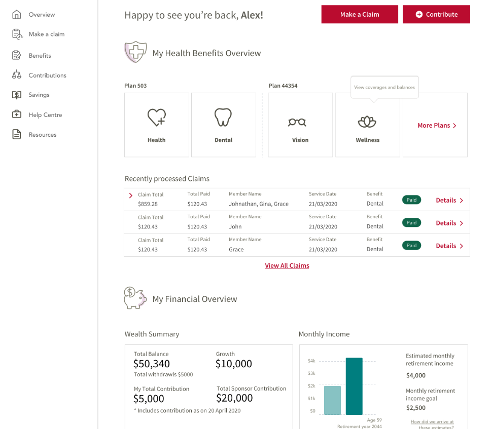
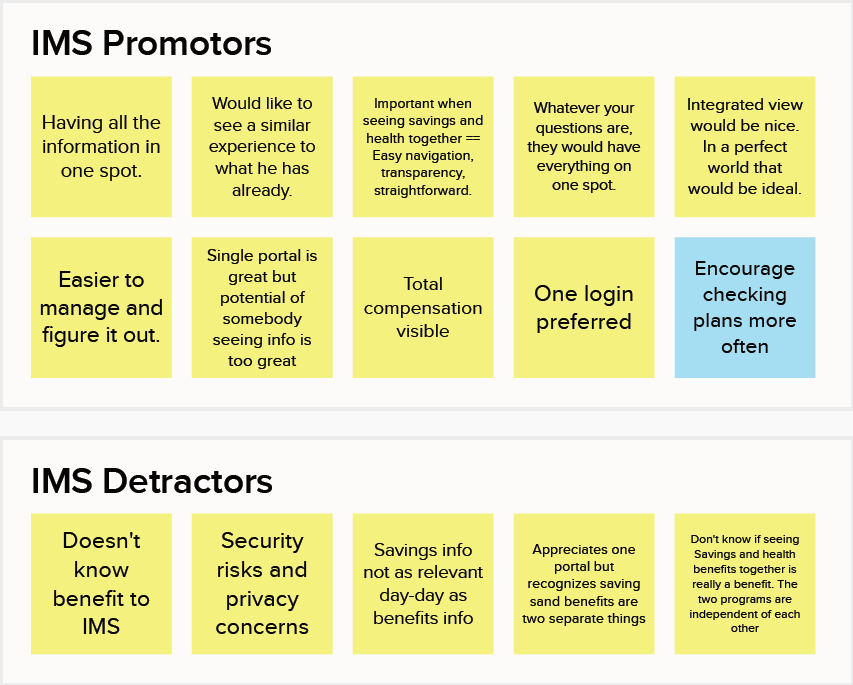
After completing user research, new user personas were created, keeping in mind that the primary problems we would be solving would be related to the unification of health benefits with wealth plans. Users were accustomed to viewing and interacting with different web applications for their health and wealth benefits up to this point. We needed an integrated dashboard view so that users could see an overview of their savings plans and health plans.
Dashboard research
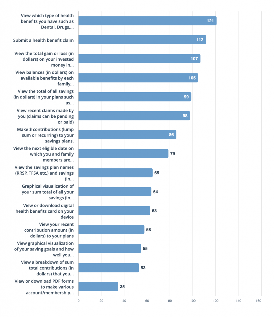
I conducted generative research study to prioritize the information that I anticipated users would like to see and act on from the dashboard.
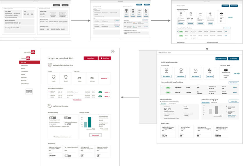
Dashboard Wireframes
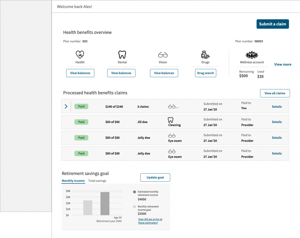
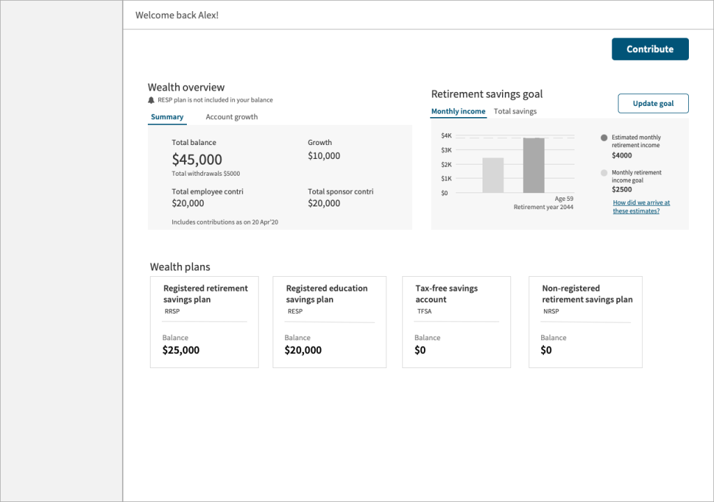
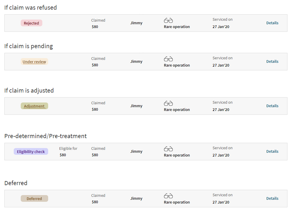
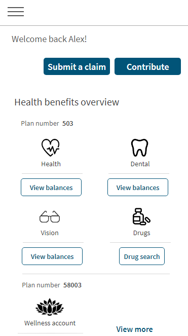
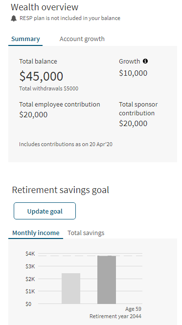
I started creating wireframes based on user research and also leveraged existing APIs. Initially, I proposed a dedicated location on the dashboard to display all primary applicable actions. However, after user testing feedback, I moved the primary actions to their respective contexts within the health and wealth sections. It was clear from the user research that users wanted to see some degree of separation or distinction in health and wealth benefits information, even though they appreciated the ability to view this information in one view or screen using a single sign-on.
