Timeline: Oct’20 – April’21
The project aimed to improve Canada Life’s mobile app, particularly the GroupNet app, which had poor ratings due to issues like failed authentications and usability problems. The team’s primary focus was addressing these critical issues, including improving the login experience, enhancing two-factor authentication, and resolving performance bottlenecks. They also worked on designing a unified mobile app experience for both health and wealth plans. Key outcomes included significantly improved app ratings on both iOS and Android platforms. The changes to the user interface and experience, especially in error handling and authentication, helped make the app more secure and user-friendly. The updated app was well-received, and the changes implemented are still part of the current version.
Intro
With only a few weeks left for the launch of integrated member site – MyCanadaLifeatWork.com, the next big initiative at Canada Life was to create a similar workplace benefits unified experience on mobile native platforms. The group health division had its own mobile app on both Android and iOS platforms while the group retirement services division didn’t have one. Existing mobile app (GroupNet) had very poor ratings due to recurring issues such as failed authentications, performance issues, usability issues and so on. Team’s most immediate goal was to solve these recurring issues. In addition to this, team also wanted UX team to start working towards a new integrated (Health + Wealth plans) native mobile application.
My role
Team Lead – User Experience Designer
I frequently collaborated with the UX Director who was also my supervisor and other UX Designers who had prior experience working on the existing mobile app – GroupNet.
Process and scope
The team came together as a mobile squad. Our highest priority was to solve critical customer issues. Due to the nature of the project, and as advised by our agile coach, we adopted an agile kanban approach.
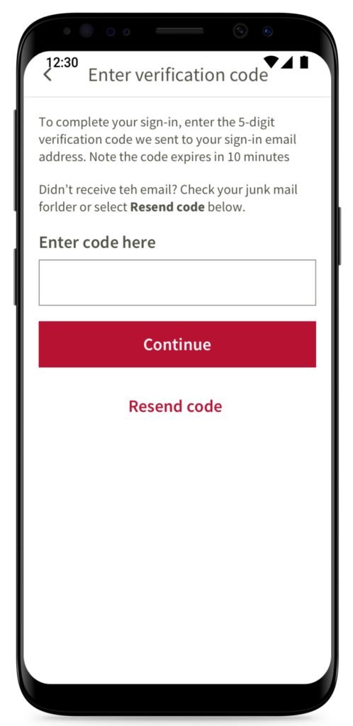
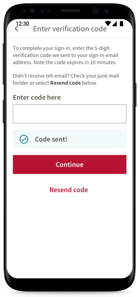
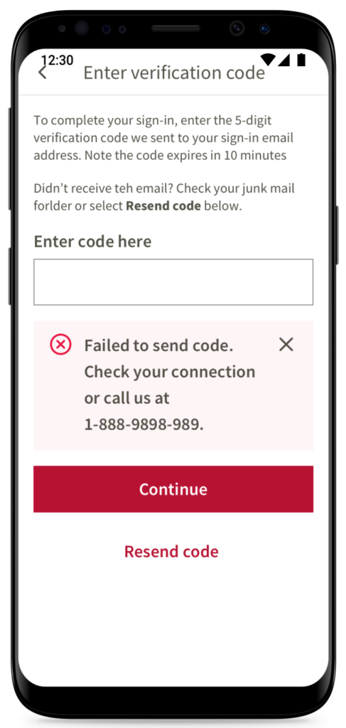
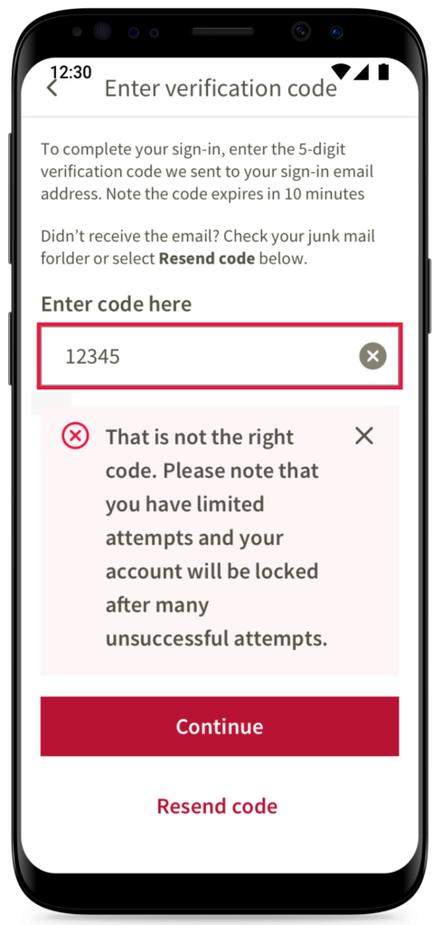
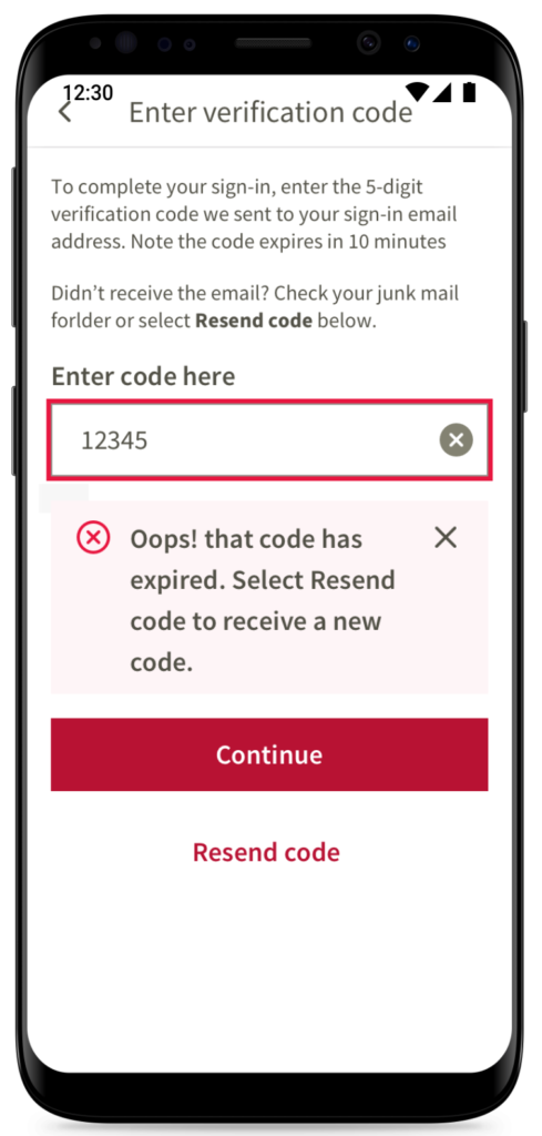
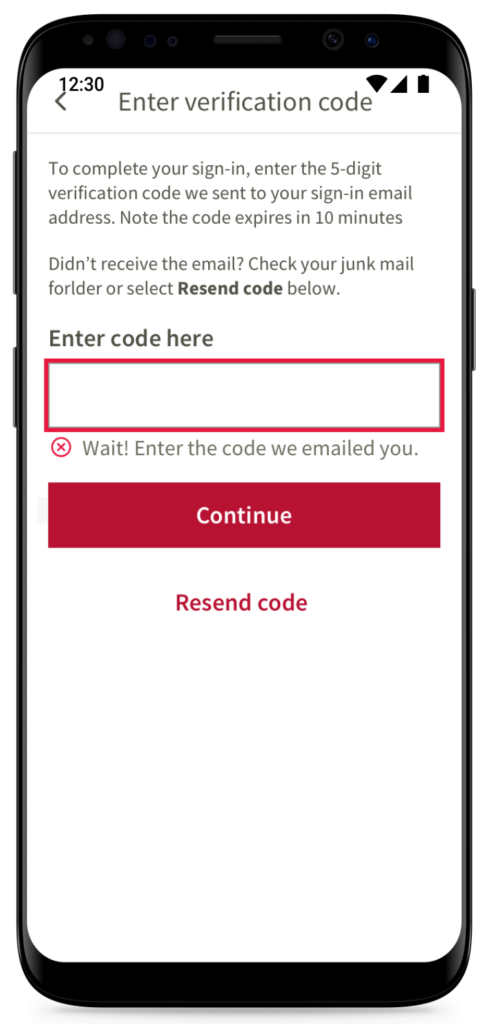
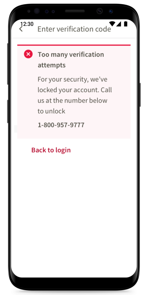
As team was looking for ways to improve login experience, I suggested some tactical changes in how certain errors were communicated to the user. I also suggested to move some services that were time consuming and not necessary to load upfront to post sign in stage. We also improved the 2 factor authentication experience by accounting for different scenarios. Signing into app was made more secure by utilizing OAuth 2.0 standard – which meant that signing experience needed to reflect this change.
Another important decision we took as a team was to utilize mobile responsive UI components that were available in the Canada Life’s design system – since we didn’t have an in house mobile native design system. Also, we decided to use common components for both Android and iOS platforms in view of resources and timelines. However, we were able to leverage significant native behavior wherever it was needed.
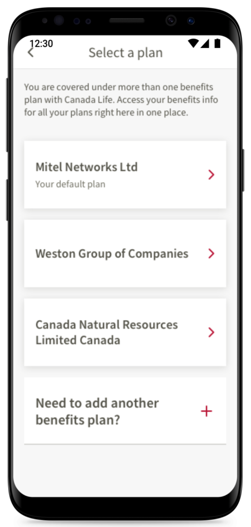
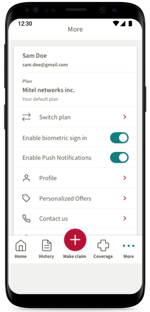
The screens below show UI/cosmetic enhancements and some UX improvements that were implemented.
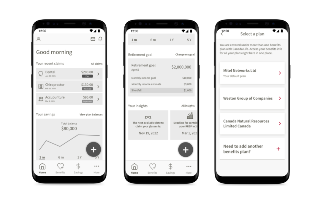
In addition to the stream of work above, the mobile squad team wanted to explore how an integrated mobile application experience might look like for the end user, and also to get early feedback. In total 4 UX designers collaborated on this effort and came up with a few variations from which one was picked as the best candidate to move forward for feedback.
WIREFRAMES AND DETAILED FLOW HAS BEEN REDACTED FROM HERE.
Outcome
The strategic initiative to build a unified mobile experience continued as the group health division’s updated mobile application launched. The ratings saw a significant improvement in both iOS and Android platforms. The screens I worked on are still available in the current mobile app.
